top of page

COLOUR
HUE =
The colour itself
SATURATION =
intensity of the colour

Brightness/VALUE =
how light or dark a colour is
colour theory
RED
❤️ 😡🩸🚨
Love, anger, danger, passion, power & violence
yellow
🤪⚠️🤕😇
Madness, naive, sickness, idyllic, insecure, obsessive
pink
💄🌷🍬 🎀
Innocence, femininity, sweetness, playful, beauty, empathy
green
🍀👻💵🔫
Nature, ominous, immaturity, darkness, corruption, danger
orange
☀️🔥🤝😄
Warmth, friendly, sociability. happiness, exotic, youth
blue
🥶🧘♂️🤷♂️😔
Cold, isolation, cerebral, calm, tranquility, melancholy, passivity
purple
🔮😈🧞♀️🦄
Fantasy, illusory, ethereal, mystical, eroticism, ominous


see it in action
colour schemes:
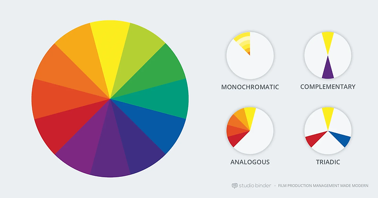
Examples of balanced colour schemes
1. monochromatic colour scheme:
This is where a single base colour/hue is extended out using shades, tones and hints.
see below for examples of monochromatic colour schemes


Monochromatic colour schemes create a deeply harmonious feeling that is soft, lulling and soothing. They come in shades of a single colour such as red, dark red, and pink.
the matrix = a green monochromatic colour scheme = sickly, supernatural effect

This colour scheme does not make it essential that your film has a harmonious feel...
it gives you a base hue which you can use to produce contrast.
watch more on Wes Anderson and colour
2. complimentary colour scheme:
This colour scheme uses two colours from opposite sides in the colour wheel to form a colour palette.
The aim is to create a 'visual life' where these colours both pop in a scene together e.g. orange & blue or red & green.


Combining warm and colder colours this scheme creates vibrant tension representing drama, internal or external conflict within a film.
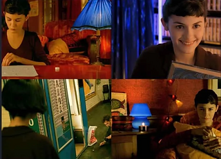
3. Analogous colour scheme:
Analogous colour scheme uses neighbours on the complimentary colour wheel,. Usually occurring in nature, common for landscapes, creating a harmonious feeling as no tension between colours.

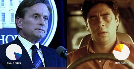
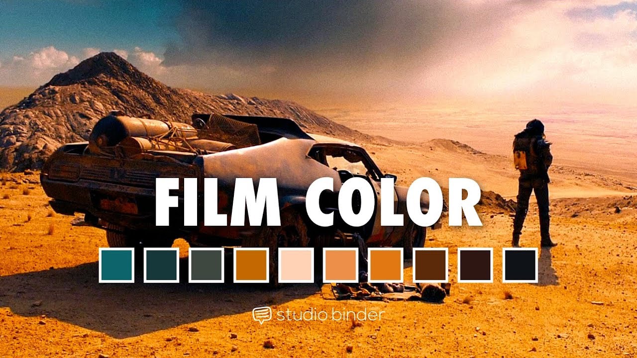
Source: Studio Binder (Film Traffic)

Directors can use colour schemes to create meaning such as parallel stories and use colour schemes to connect them
how to create a analogous colour scheme:
-
choose a dominate colour
-
choose a second to support
-
choose a third to accent
-
use greys, blacks, white tones
4. triadic colour scheme:
Three colours that are evenly spaced around the colour wheel are used to create a colour palette for a film.
One dominant and the other two are complimentary.

This colour scheme is sometimes avoided due to its cartoon nature, it is particularly associated with Superman.
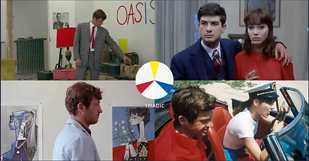

Striking and vibrant even when hues are saturated.
watch more about how three colours are used in films
symbolism through colour:
There are three key techniques of creating meaningful connections about ideas and themes through colours on screen.
-
discordant colour
-
associative colour
-
transitional colour
discordant colour:

-
A deliberate choice by the director to deviate from ‘balanced’ movie colours schemes refocuses attention.
-
Discording colours and help a character, detail or moment stand out from the rest of the film.
-
Refocusing attention of viewer to a specific person, place or thing.

Associative colour:
This is when a recurring colour or scheme presents a theme or character in a film, in turn connecting a visual spectacle with emotional storytelling.
what is it?
key Examples:
-
Kill Bill Vol. 1
-
Vertigo
-
The Dark Knight
-
The Godfather
Colour associated with characters:


Colour associated with emotions:
Watch how Alfred Hitchcock uses ASSOCIATIVE colour in this scene from vertigo. notice Scotties interaction with Madeleine
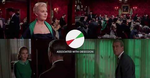
Source: Studio Binder
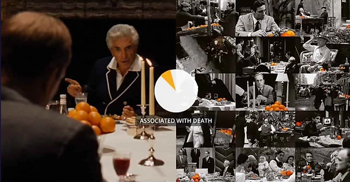
The Godfather:
death
see how effective associative colour can look on screen.
Source: Studio Binder
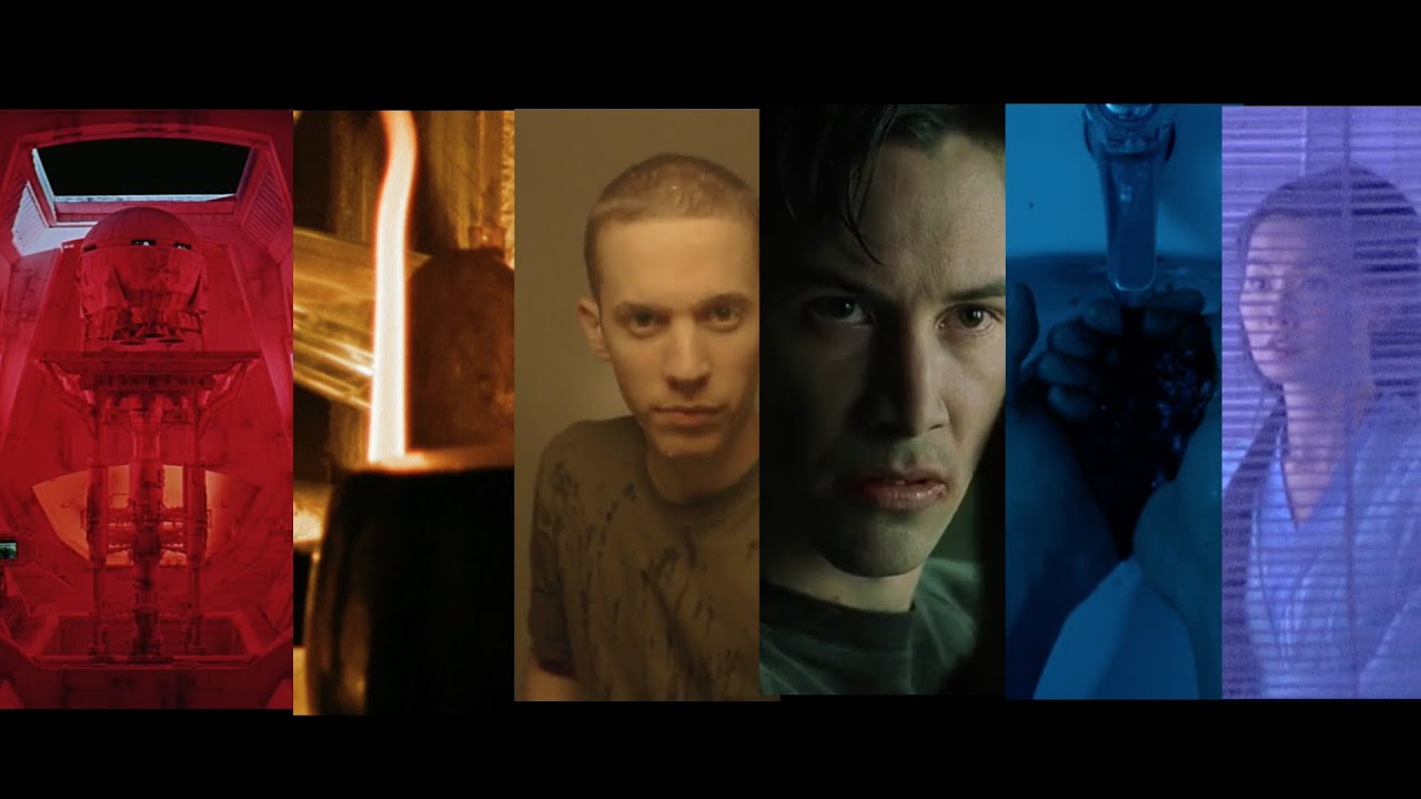
transitional colour:
This is where a recurring film palette or colour shifts over the course of the film, often representing a change/transformation/growth in the character, story or theme.

It is a powerful way to subliminally communicate a character or story arc in a visual manner e.g. Up, Tokyo Drifter, Star Wars vs return of the Jedi.
Source: Studio Binder


Source: Studio Binder
watch more videos about colour theory
04:44

01:22
16:25

01:59

01:54

01:48
02:00

13:01
bottom of page