
COLOUR GRADING VS CORRECTION
colour correction
The first technical process that fixes color issues, making footage appear as natural and clean as possible, as if they were part of the real world.
colour grading
A technical process but it's more of a creative purpose colou8ring footage in new and unnatural ways to add atmosphere and emotion to shots.
To summarise:
Colour correction = adjusting levels for a natural look vs
Colour grading = creative intention to create a certain look e.g. a moody blue scene
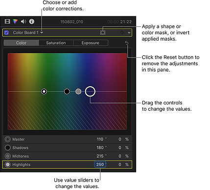
using the colour board in fcpx:
written instructions
colour correction:
This is the first step to making your footage look really, really good in post production. It's important that each shot from the same scene looks consistent with the rest for continuity.
why?
-
To create visual consistency between scenes
-
Establishes true levels and colors
-
Allows for accurate and effective adjustments.
how?
Adjusting the following in the Lumetri panel
-
White and black levels
-
Exposure
-
Contrast
-
White balance
TOP TIPS
You’ll need to go through this process if you hope to cut together footage that may not look exactly the same, but needs to be in the used in the same scene.
EXPOSURE
-
To balance the exposure, use the exposure slider. The goal is to find a good middle, meaning balanced mid-tones.
-
Dragging the exposure slider a little too much to the right clips the whites.
-
Dragging the exposure slider a little too much to the left crushes our darks.
-
Find a nice balance between our whites and darks.
-
After tweaking your exposure, highlights, and shadows, your image may look flatter than you would like. It’s time to add some contrast.
-
Adjusting the contrast slider pushes your highs up and your lows down, so take care not to get too crazy, as you just spent all this time ensuring you are within the 0-100 IRE range.
contrast
-
Adjust the highlights and shadows sliders, to bring down the highlights or lift the shadows.
-
Be mindful of your highlights to ensure no clipping occurs in your whites or solid blacks area in your darks.
-
The goal is to find a great looking and natural image, often that means keeping your whites and darks in check, just as our eyes naturally do.
Highlights
-
Start with temperature slider to adjust how warm and cool you want your colors to be.
-
In the case of Lumetri, sliding the temperature slider to the left will cool your footage, while sliding to the right will warm it up.
temperature
-
Add some punch to our colors by adjusting the saturation, or the amount of hue in each color. This will affect how bright or muted the colors will appear.
-
Use the saturation slider. Shifting to the right will add more saturation, moving left will remove saturation.
saturation & HUE
-
Just as color can be additive, it can also be subtractive. By dragging the tint slider to magenta, it removes the green from the shot. Neat, right?
adding colour
Color temperature is measured in Kelvin, and usually falls between 2500-9999 degrees. Higher temperatures are cool, lending a bluishness to your footage. Lower temperatures are warm, giving your footage a yellow-orange color.
Getting the white balance correct in-camera, means you don't need to adjust the temperature in post to correct it.
colour GRADING:
why?
-
As an optional second step, provides a specific visual style for the film.
-
Alters the colour of the film to match a particular mood, tone, or theme.
-
Horror films: often feature a low-saturated, cool hue to them, making it scarier for the viewer.
how?
-
Immensely ups your production value with relatively little cost or labor
-
RGB Parade Scope has individual colour channels of red, green and blue.
-
Exposure slider. The goal is to find a good middle, meaning balanced mid-tones.
what is a colourist?
more videos on colour


